
Contents
- 1. Introduction
- 2. Create a Professional First Impression
- 3. Use Real Photos of Doctors, Staff, and Facilities
- 4. Explain Medical Services in Simple Language
- 5. Display Genuine Reviews and Professional Credentials
- 6. Make Website Navigation Simple and Predictable
- 7. Design for Mobile Users and Accessibility
- 8. Make Online Appointment Booking Easy
- 9. Be Transparent About Fees, Insurance, and Policies
- 10. Improve Website Speed and Security
- 11. Use SEO and Helpful Content to Reach the Right Patients
- 12. Keep the Patient Experience Consistent
- 13. How Does Healthcare Website Design Increase Patient Bookings?
- 14. Conclusion
- 15. FAQs
Introduction
Before booking an appointment, most patients want answers to a few simple questions: Can I trust this healthcare provider? Are the services right for me? How easy is it to schedule a visit?
Your website often helps them answer these questions before they speak to your team.
Imagine two clinics offering similar services. The first has a professional website with genuine doctor photographs, clear service information, patient reviews, and a simple appointment form. The second has an outdated layout, confusing navigation, and contact details that are difficult to find.
Even if both clinics provide excellent medical care, their websites create very different first impressions.
This is why healthcare website design involves more than attractive visuals. It should help patients find reliable information, understand their options, and feel comfortable taking the next step.
A well-planned medical website can strengthen credibility, reduce booking friction, and support long-term patient relationships. Here are the key elements that make a difference.
Create a Professional First Impression
When patients visit your website, they quickly assess whether the practice appears professional, reliable, and relevant to their needs.
An outdated design, inconsistent typography, cluttered pages, or broken links can make a practice appear less organized. A clean, well-structured website helps visitors focus on what matters.
To create a positive first impression:
- Use a consistent colour palette, typography, and layout.
- Display your main medical services clearly.
- Keep important information easy to find.
- Ensure pages load quickly and work smoothly.
- Use clear headings and readable text.
Your homepage should immediately communicate who you are, what you offer, and how patients can contact you.
Avoid filling the first screen with too much text or too many competing buttons. A clear message and a visible appointment option give visitors a straightforward starting point.
Use Real Photos of Doctors, Staff, and Facilities

Healthcare is personal. Patients want to know who will treat them and what they can expect when they arrive.
Generic stock photographs may look polished, but they do not help visitors become familiar with your actual practice. Genuine photographs provide a more personal and recognizable introduction.
Consider including:
- Professional photographs of doctors and specialists.
- Images of your reception area, consultation rooms, and facilities.
- Photographs of your medical team and support staff.
- Relevant images of equipment and treatment facilities.
For example, a patient visiting a dental clinic for the first time may feel more comfortable after seeing the dentist, treatment room, and clinic environment online.
Use professional photography where possible, and obtain appropriate consent before publishing identifiable patient images. Avoid presenting stock photographs as actual staff or patients.
Authentic visuals help patients understand what to expect and make your website feel connected to the real people behind the practice.
Explain Medical Services in Simple Language
Medical terminology can be difficult for patients to understand, particularly when they are already worried about a symptom, diagnosis, or procedure.
Your website should explain healthcare services in clear, familiar language without compromising medical accuracy.
Each service page should answer common patient questions:
- What is the service or treatment?
- Who may need it?
- What happens during the appointment?
- How should patients prepare?
- What are the next steps?
- How can someone arrange a consultation?
For example, instead of relying entirely on technical descriptions of a diagnostic procedure, explain its purpose, what patients can generally expect, and when they should speak with a qualified healthcare professional.
Avoid promising guaranteed outcomes or suggesting that one treatment is suitable for everyone. Medical information should be accurate, appropriately qualified, and reviewed by a qualified professional.
Clear communication demonstrates respect for patients and helps them make informed decisions.
Display Genuine Reviews and Professional Credentials
Patients often look for reassurance before choosing a healthcare provider. Genuine reviews, relevant qualifications, and clear information about the medical team can help them assess whether a practice meets their needs.
Make these details easy to find across relevant pages.
Patient reviews: Display authentic feedback from appropriate review platforms or with permission. Keep testimonials accurate and avoid editing them in ways that change their meaning.
Doctor profiles: Include qualifications, specialties, professional experience, relevant registrations, and areas of clinical interest where applicable.
Hospital and clinic information: Explain the services offered, available facilities, location, and relevant professional affiliations.
Patient experiences: Where appropriate and consented to, share patient stories that provide useful context without disclosing confidential medical information.
Do not fabricate testimonials, ratings, or success statistics. Patient privacy is particularly important in healthcare, so obtain informed consent before publishing personal stories or identifiable information.
Trust develops when patients can verify who provides the care and understand the experiences others have shared.
Make Website Navigation Simple and Predictable
Patients should not have to search through several menus to find a doctor, understand a service, or locate contact details.
A logical navigation structure improves usability and helps search engines understand how your website is organized.
For most healthcare websites, useful menu items include:
- Home
- About Us
- Doctors or Medical Team
- Services or Specialties
- Patient Resources
- Blog or Health
- Information
- Contact Us
- Book an Appointment
For hospitals with multiple departments, organize services into relevant categories. Individual specialty pages can then provide more detailed information about treatments, doctors, and facilities.
Keep the primary appointment button visible and use familiar labels rather than creative wording that may confuse visitors.
Breadcrumbs can also help users understand where they are within larger websites.
A simple structure makes it easier for patients to find information without unnecessary effort.
Design for Mobile Users and Accessibility
A healthcare website must work well on smartphones, tablets, and desktop computers.
Patients may search for a nearby clinic while travelling, compare specialists during a break, or try to book an appointment from home. If your website requires constant zooming or has buttons that are difficult to tap, visitors may struggle to complete these tasks.
A mobile-friendly healthcare website should include:
- Readable text without horizontal scrolling.
- Buttons large enough to tap comfortably.
- Short forms with clearly labelled fields.
- Clickable telephone numbers where appropriate.
- Fast-loading pages on mobile connections.
- Appointment options that work on smaller screens.
Accessibility is equally important. Use sufficient colour contrast, descriptive image alt text, clear form labels, keyboard-friendly navigation, and captions for videos containing spoken information.
Write in plain language and make error messages easy to understand.
These improvements support patients with different abilities, devices, and levels of digital confidence. They also make everyday tasks easier for all visitors.
Make Online Appointment Booking Easy
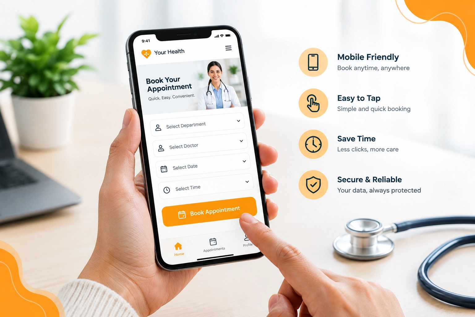
A website may attract visitors and answer their questions, but a complicated booking process can prevent them from completing an appointment request.
The goal is to make the next step clear, convenient, and reliable.
Effective booking features include:
Visible calls to action: Use clear labels such as “Book an Appointment,” “Request a Consultation,” or “Call the Clinic.”
Short forms: Ask only for the information needed to handle the initial request. Additional medical details can be collected through an appropriate secure process.
Clear confirmation: Tell patients when their request has been received and explain whether the appointment is confirmed or still awaiting approval.
Flexible contact options: Offer online booking, telephone contact, or another suitable method based on the practice’s workflow.
Reliable functionality: Test forms, confirmation messages, appointment availability, and mobile interactions regularly.
If appointments require staff approval, communicate that clearly instead of implying that a slot has been confirmed.
Also, protect personal information and use suitable security measures when collecting or transmitting patient data.
A straightforward booking journey reduces unnecessary steps and helps interested visitors take action.
Be Transparent About Fees, Insurance, and Policies
Uncertainty about costs can make patients hesitate before booking, especially when considering specialist consultations, diagnostic services, or elective procedures.
Where possible, explain consultation fees, available payment methods, accepted insurance plans, and relevant billing policies.
If the final price depends on the patient’s condition or treatment requirements, explain why and tell visitors how they can request an estimate.
You can also answer common questions about cancellations, appointment changes, payment procedures, and insurance verification.
Avoid publishing prices that are outdated or presenting estimates as guaranteed final costs. Keep information current and explain any important limitations.
Clear financial information helps patients understand what to expect before contacting your team.
Improve Website Speed and Security
Website performance affects how easily patients can access information. Slow pages, broken links, repeated errors, and unreliable forms create unnecessary frustration.
Healthcare websites should be designed and maintained with performance and security in mind.
Important measures include:
- Compressing images and using suitable image formats.
- Reducing unnecessary scripts and plugins.
- Using reliable hosting and HTTPS.
- Keeping the content management system and extensions updated.
- Backing up the website and monitoring for technical issues.
- Restricting access to administrative accounts.
- Protecting forms and patient information with appropriate safeguards.
If your website offers patient portals, online reports, or appointment systems that handle sensitive information, the technical requirements may be more extensive.
Choose security controls based on the data collected, applicable laws, and the systems involved. Avoid collecting sensitive health information through ordinary contact forms unless the process is designed and secured for that purpose.
A fast, dependable website helps patients access services with fewer interruptions.
Use SEO and Helpful Content to Reach the Right Patients
A trustworthy website also needs to be discoverable.
Healthcare SEO helps search engines understand your services and connect your pages with relevant searches. Helpful content can also answer patient questions before they contact your practice.
Start with a clear website structure and dedicated pages for important services and specialties. Include relevant location information when serving a specific geographic area.
Useful SEO practices include:
- Writing descriptive page titles and meta descriptions.
- Using one clear primary heading on each page.
- Creating original, informative service descriptions.
- Adding accurate doctor and clinic information.
- Using internal links between related services and resources.
- Maintaining consistent local business details.
- Optimizing page speed and mobile usability.
- Adding appropriate structured data where eligible.
For Answer Engine Optimization (AEO), structure content around real patient questions. Clear headings, concise explanations, and short FAQs make answers easier to understand and extract.
For Generative Engine Optimization (GEO), prioritize original, useful information, clearly identified medical expertise, reliable sources, and consistent factual details.
No SEO or AEO technique guarantees a particular ranking or inclusion in AI-generated answers. The objective is to make your website useful, understandable, and technically accessible to both people and search systems.
Keep the Patient Experience Consistent
Trust is built across the entire journey, not through one attractive homepage.
Imagine a patient landing on a professional homepage but finding outdated information on a service page. They then encounter a broken appointment form or receive a confirmation message that does not explain what happens next.
These inconsistencies can undermine the confidence created by the initial visit.
Review your website regularly to ensure that:
- Doctor profiles and qualifications are accurate.
- Services, timings, and contact details are current.
- Design and writing style remain consistent.
- Appointment links and forms work correctly.
- Reviews and patient information are handled appropriately.
- Important pages provide a clear next step.
A scheduled review, supported by feedback from patients and staff, helps identify issues before they become ongoing obstacles.
How Does Healthcare Website Design Increase Patient Bookings?
Healthcare website design can support appointment bookings by making patients feel informed, reducing uncertainty, and simplifying the steps required to contact a provider.
Its impact can be evaluated through measurable indicators such as:
- Appointment requests submitted.
- Booking form completion rates.
- Clicks on telephone and appointment buttons.
- Visits to important service pages.
- Mobile engagement and page performance.
- Abandoned booking forms.
- Confirmed appointments generated through the website.
Use analytics and booking data to understand where visitors encounter difficulties. For example, if many people visit a service page but few proceed to booking, review the clarity of the content, visibility of the call to action, and booking process.
Avoid assuming that design changes alone will increase bookings. Results also depend on patient demand, service availability, competition, pricing, and the quality of the care offered.
Conclusion
A well-designed healthcare website helps patients understand your services, learn about your medical team, and decide how to proceed with greater confidence.
From genuine photography and clear medical information to accessible layouts, reliable booking forms, transparent policies, and useful SEO content, every element contributes to the overall patient experience.
The most effective approach is to treat your website as an important part of patient communication rather than simply an online brochure.
Start by reviewing your homepage, service pages, mobile experience, and appointment process. Fix the issues that make it difficult for patients to find information or contact your team, then measure the results.
Looking to improve your healthcare website? WebUncles can help you evaluate your website structure, user experience, service pages, and appointment journey to identify practical opportunities for improvement.
FAQs
A clear layout, genuine doctor profiles, accurate medical information, authentic reviews, and secure booking options help patients evaluate a practice and understand what to expect.
It should include services, doctor profiles, clinic details, contact information, appointment options, patient resources, privacy information, and relevant FAQs.
Yes. A user-friendly website can reduce friction by making services easier to understand and appointments easier to request. Actual results depend on several factors.
Mobile-friendly design helps patients read information, contact the clinic, and complete booking forms on smartphones and tablets.
Use helpful medical content, descriptive headings, relevant service pages, accurate business details, clear answers to patient questions, and appropriate structured data.
Check essential information and booking functions regularly. Conduct a broader review at least annually and whenever services, staff, or website features change.
Use visible appointment buttons, short forms, clear confirmation messages, reliable functionality, and alternative contact methods when needed.

